Role: Art direction + design.
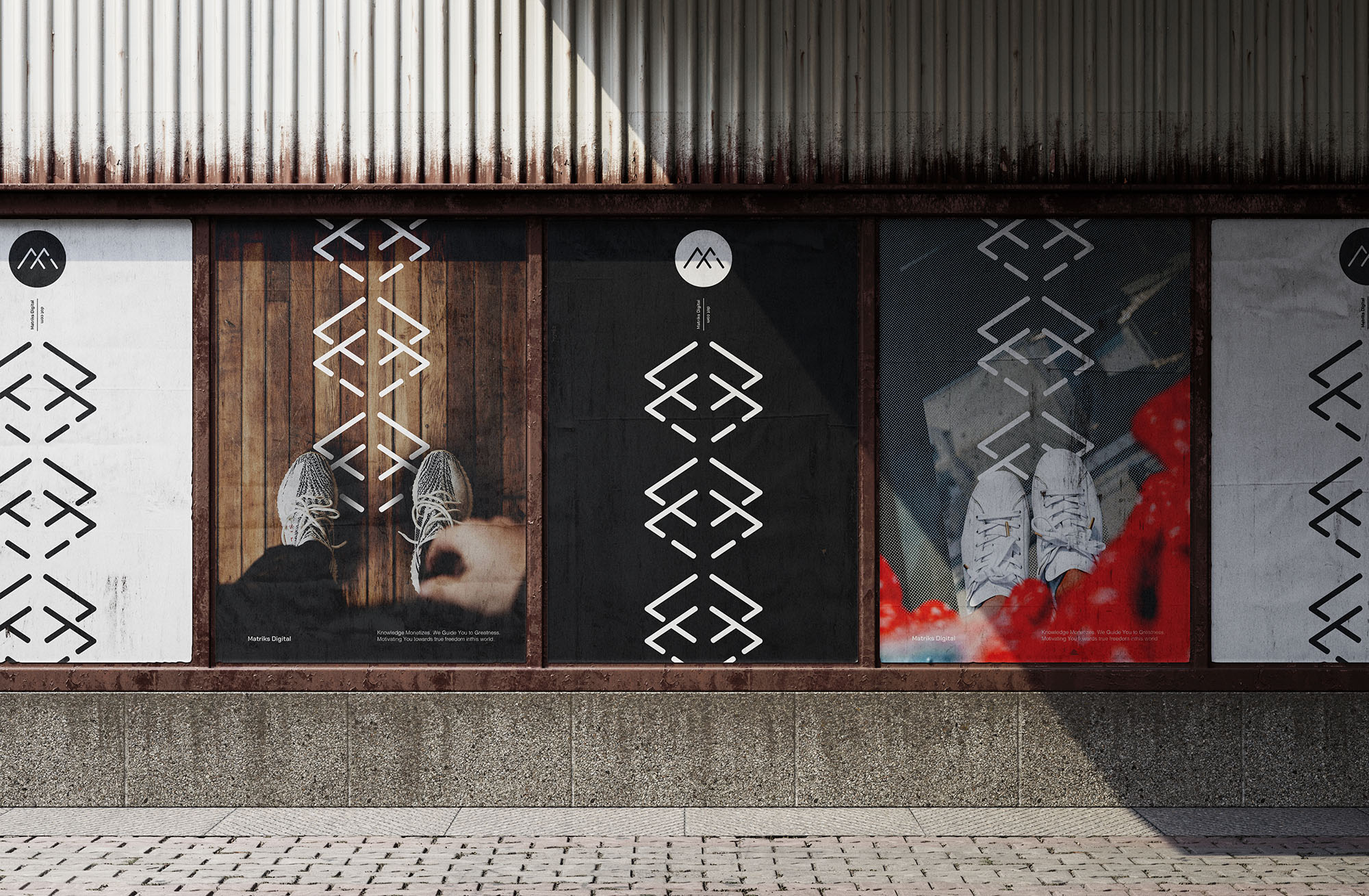
Matriks Digital offer habitual, lifestyle and social community resources to support your personal development and fulfillment. They are motivational at heart, with a very strong visual USP.
↓

The rebrand was driven by building on what they already have, adding layers to emphasise the many ways their offering can help you take the first steps in the right direction.
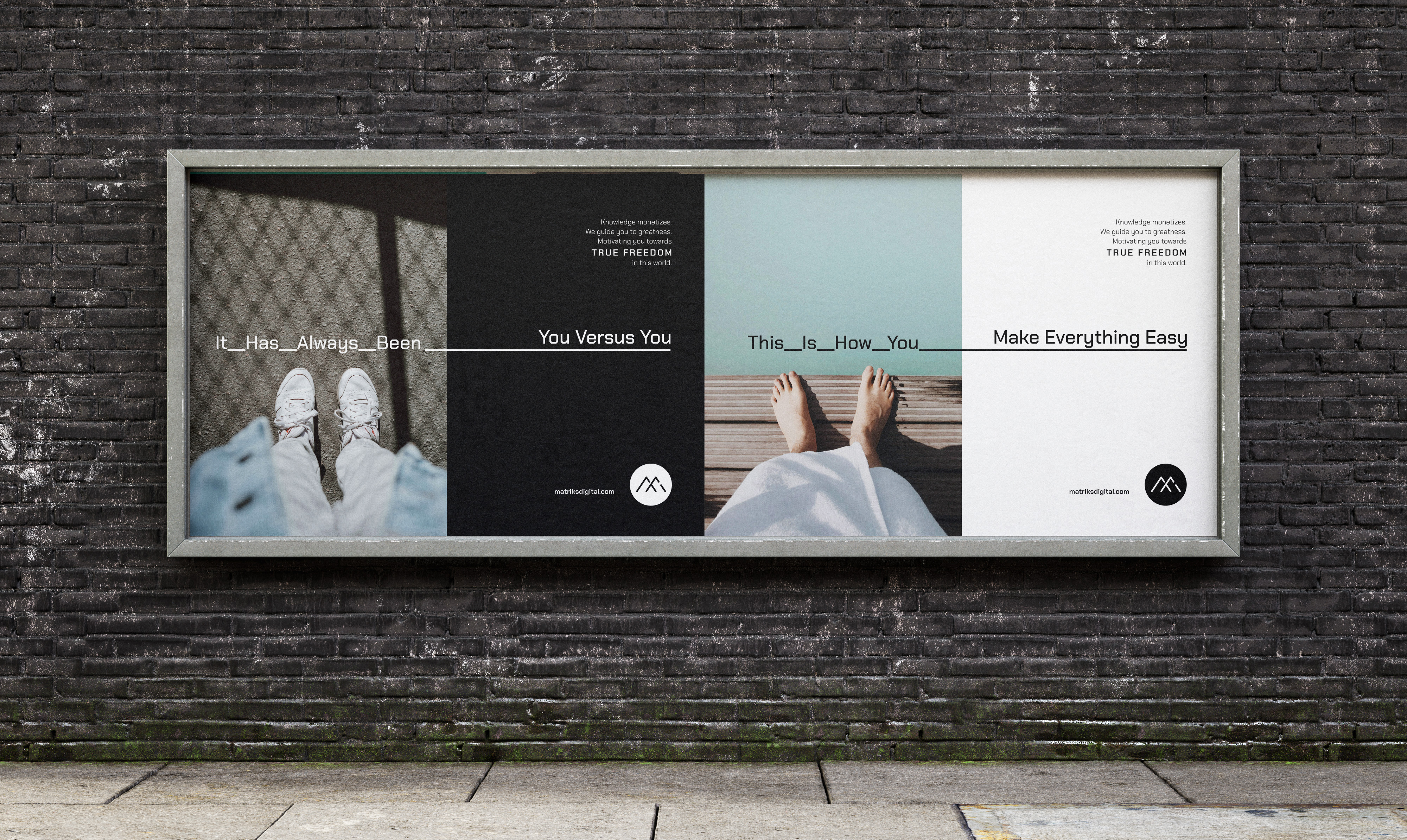
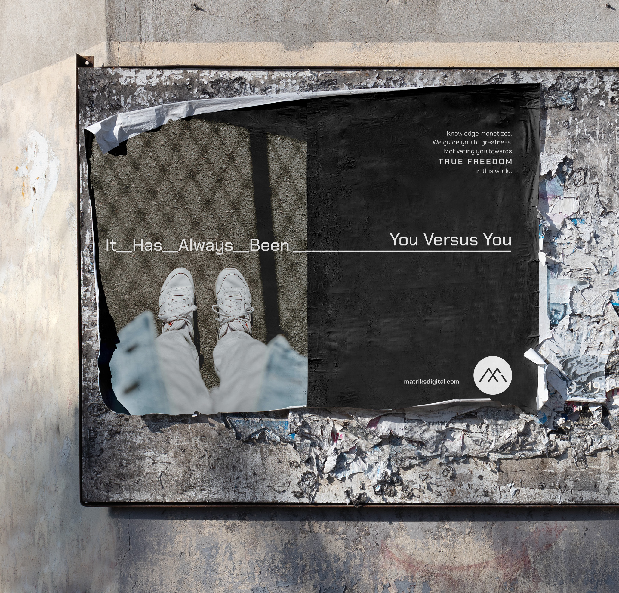
Taking the lead from messages on their popular social channels, stand-alone posters were developed using the photo and video style that has made them so distinctive. The typographic approach strengthened the idea of turning a corner towards positive change.
↓


Social carousels were created to align with the multi-sheet design approach, which uses underscoring to connect each word in the first half of the statement, while the second half has the words underlined in their entirety.
↓

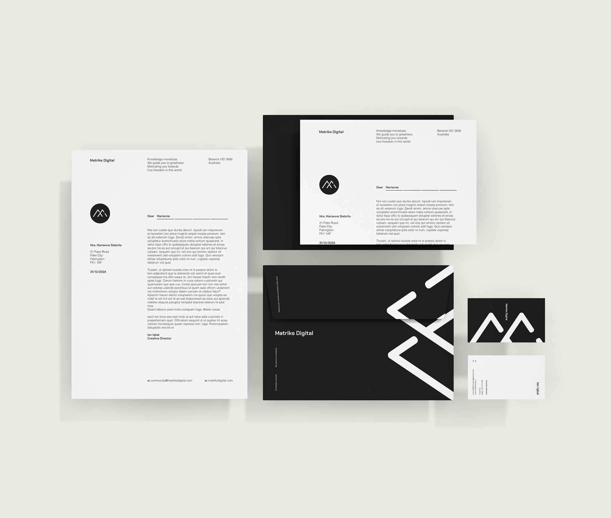
The new work was then rolled out across various brand-appropriate physical formats.
↓


A column influenced by the DNA strand was created using the logomark, building on the idea that the Matriks proposition had to become part of you in order to truly be effective. It also served as a ‘path forward’ for the feet in the photography.
_______________________________________________
Role: Art direction + design. Work made at Semi-famous.
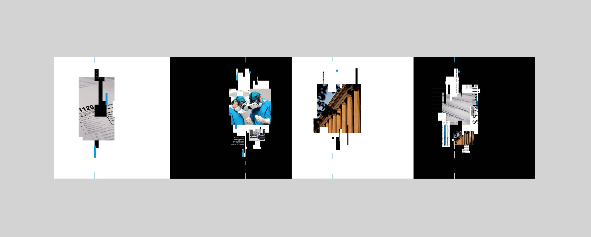
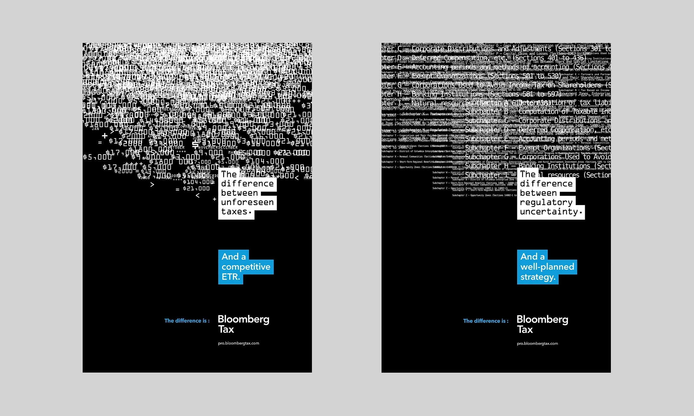
Semi-famous recently developed and delivered an integrated brand campaign spanning three businesses for Bloomberg Industry Group.
“The difference is” campaign is driven by a simple, strong, premise that delivers a powerful flexible product story and takes aim at the competition.
↓
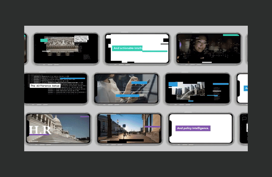
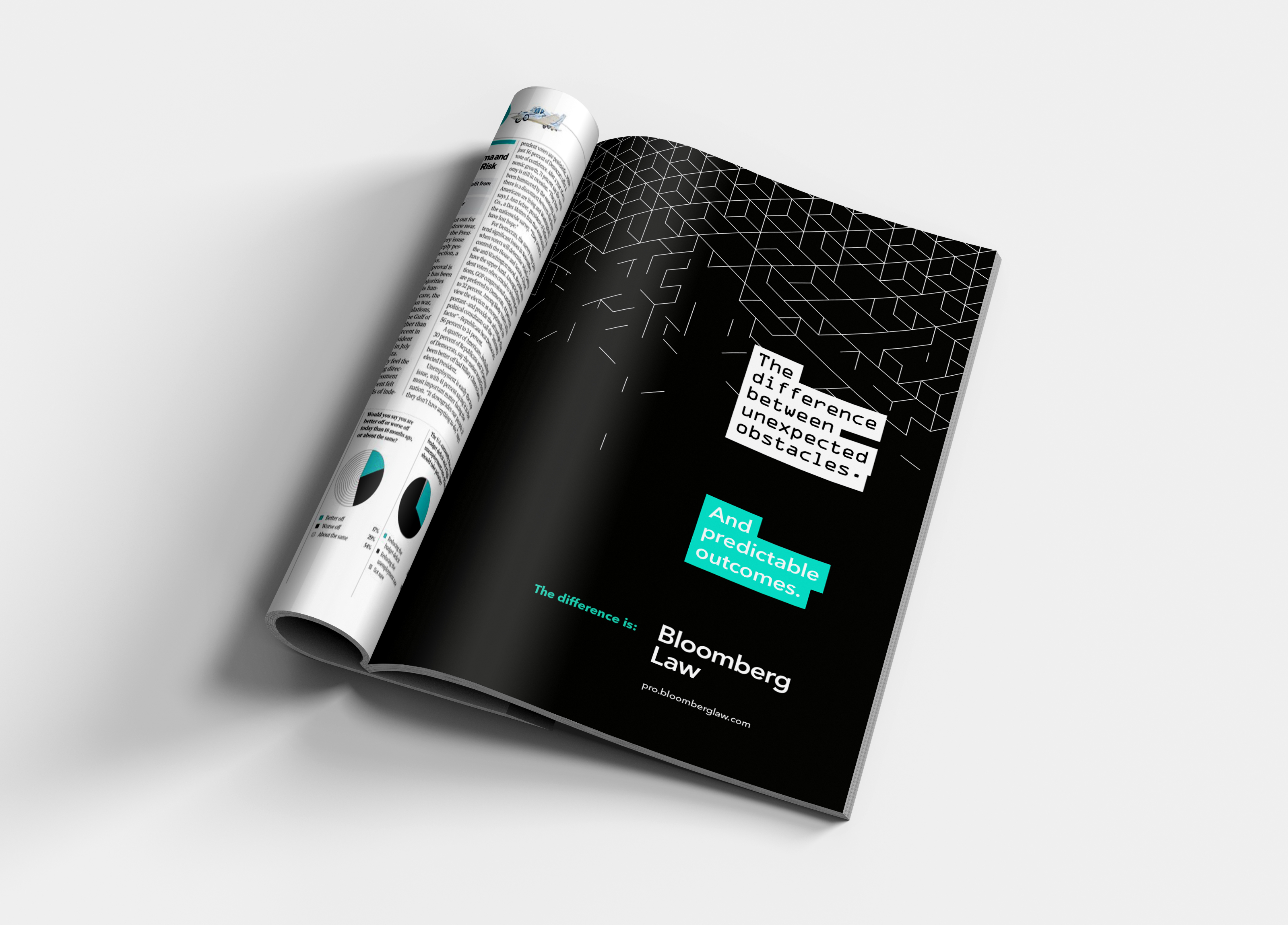
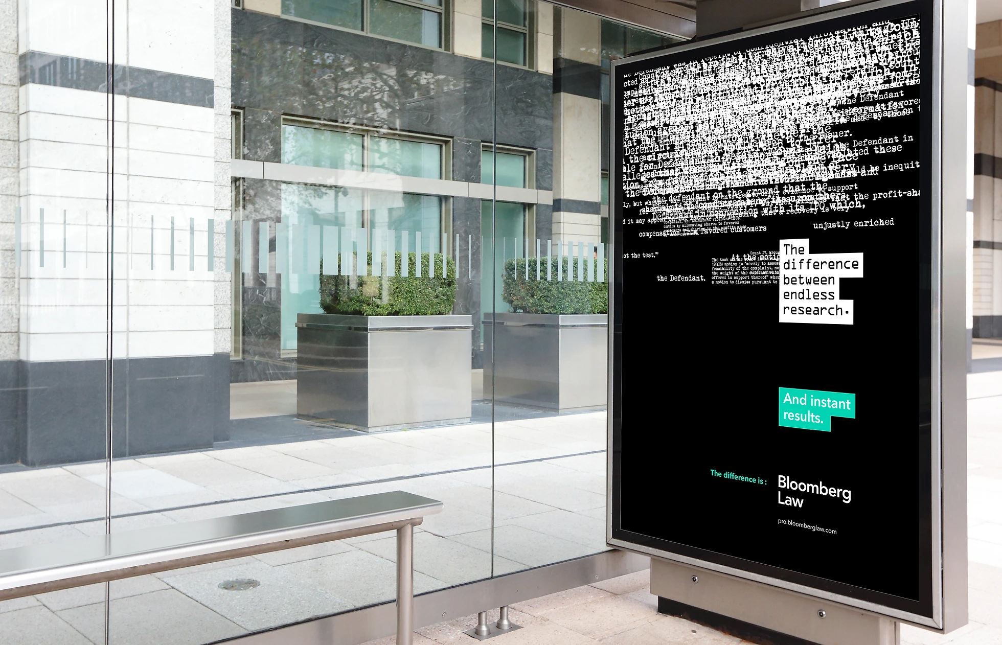

This framework allowed Semi-famous to develop compelling messaging for Bloomberg Government, Bloomberg Tax and Bloomberg Law – all businesses with complex stories to tell, each to very specialised industries.
With products that offer customers everything from real-time tracking of state-by-state marijuana legislation, to access to tenders to build submarines for the Pentagon, we had to get into the weeds and still craft a simple story.
The team produced over 60 video assets, and hundreds of print and digital assets - all driven by one narrative.
↓


Creative Director: Damian Totman
Project Managers: Laura Bailey, Dan Heighes
Words: Nat Whitten
Art Direction: Craig Baxter
Design: Gene Chen / Graham Handley
Animation: Ultra Studio
Editing: Rob Ward
↓
Initial sketches and concepts.
_______________________________________________
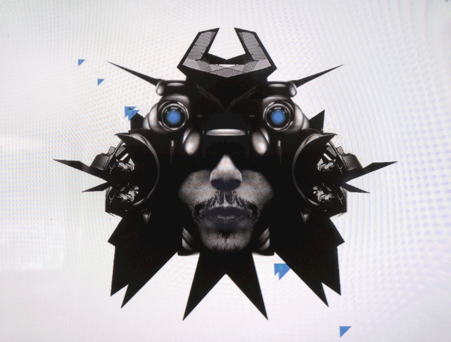
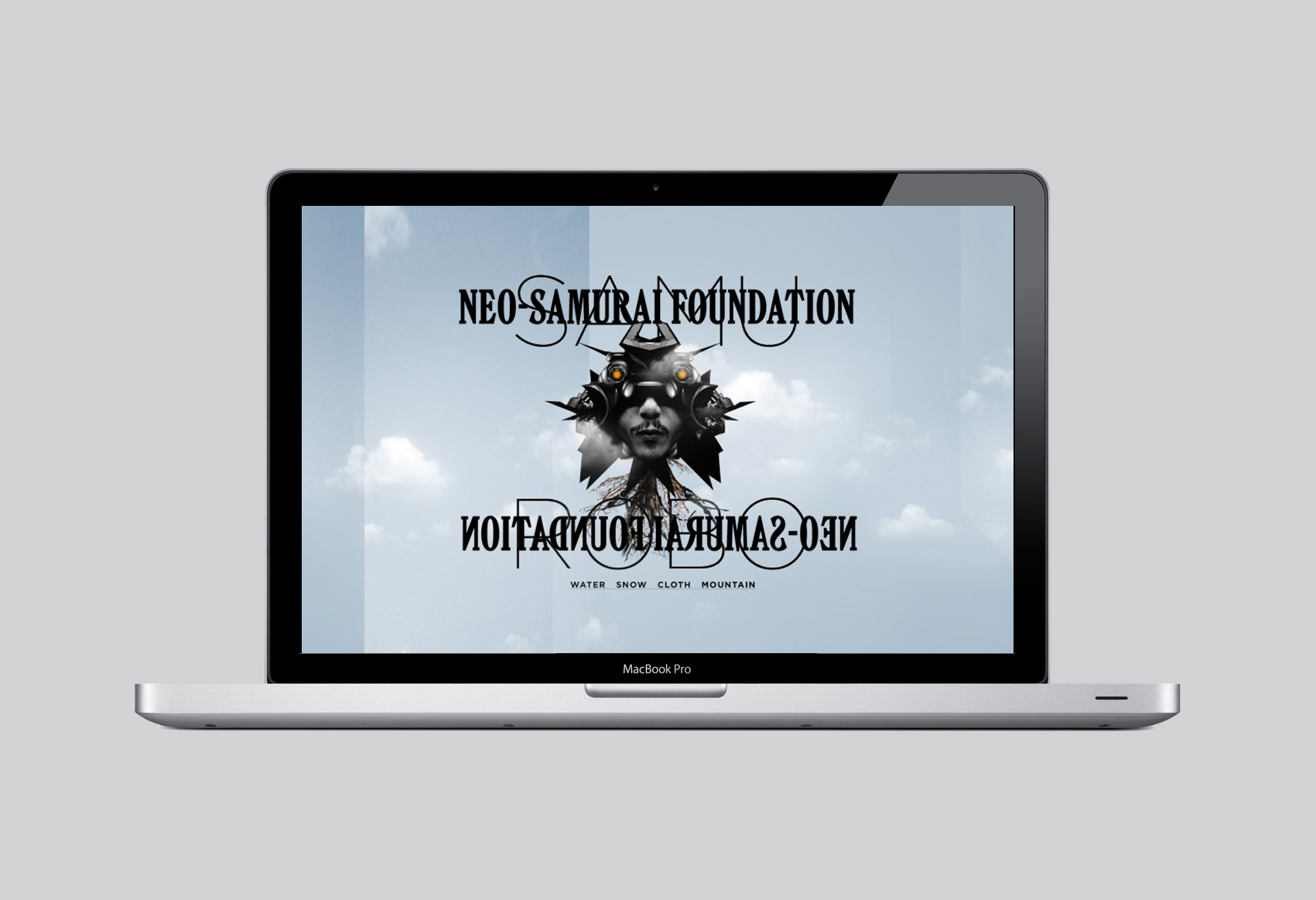
A concept for an art collective that blends a fairly unique comination of interests: biohumanoid samurai, gothic surrealism plus the juxtaposing of images of nature and digital glitch graphics.
↓


_______________________________________________
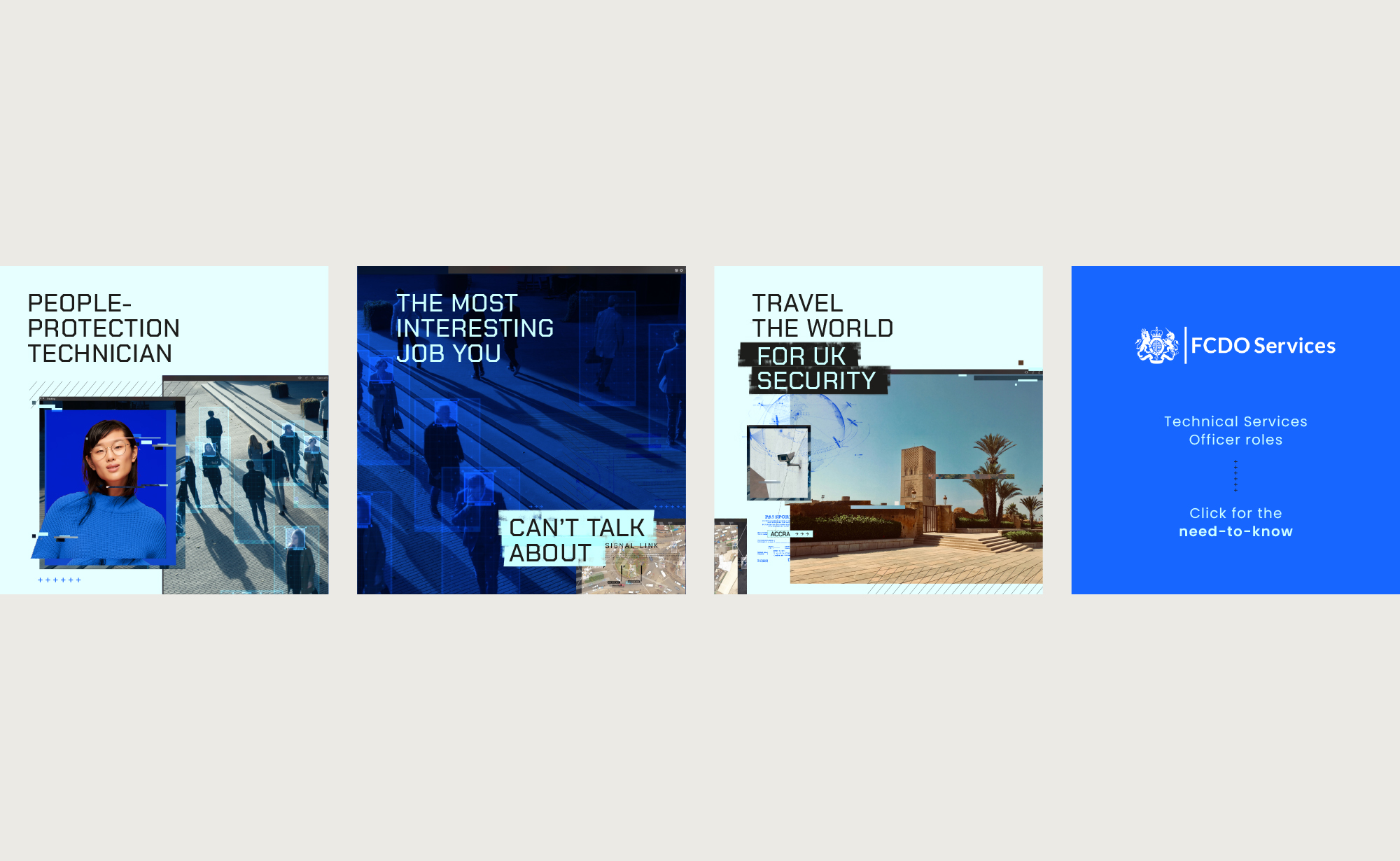
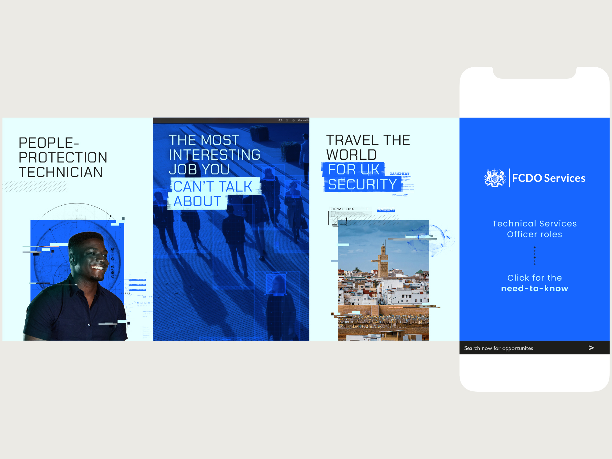
Role: Art direction + design. Made at TMPW.
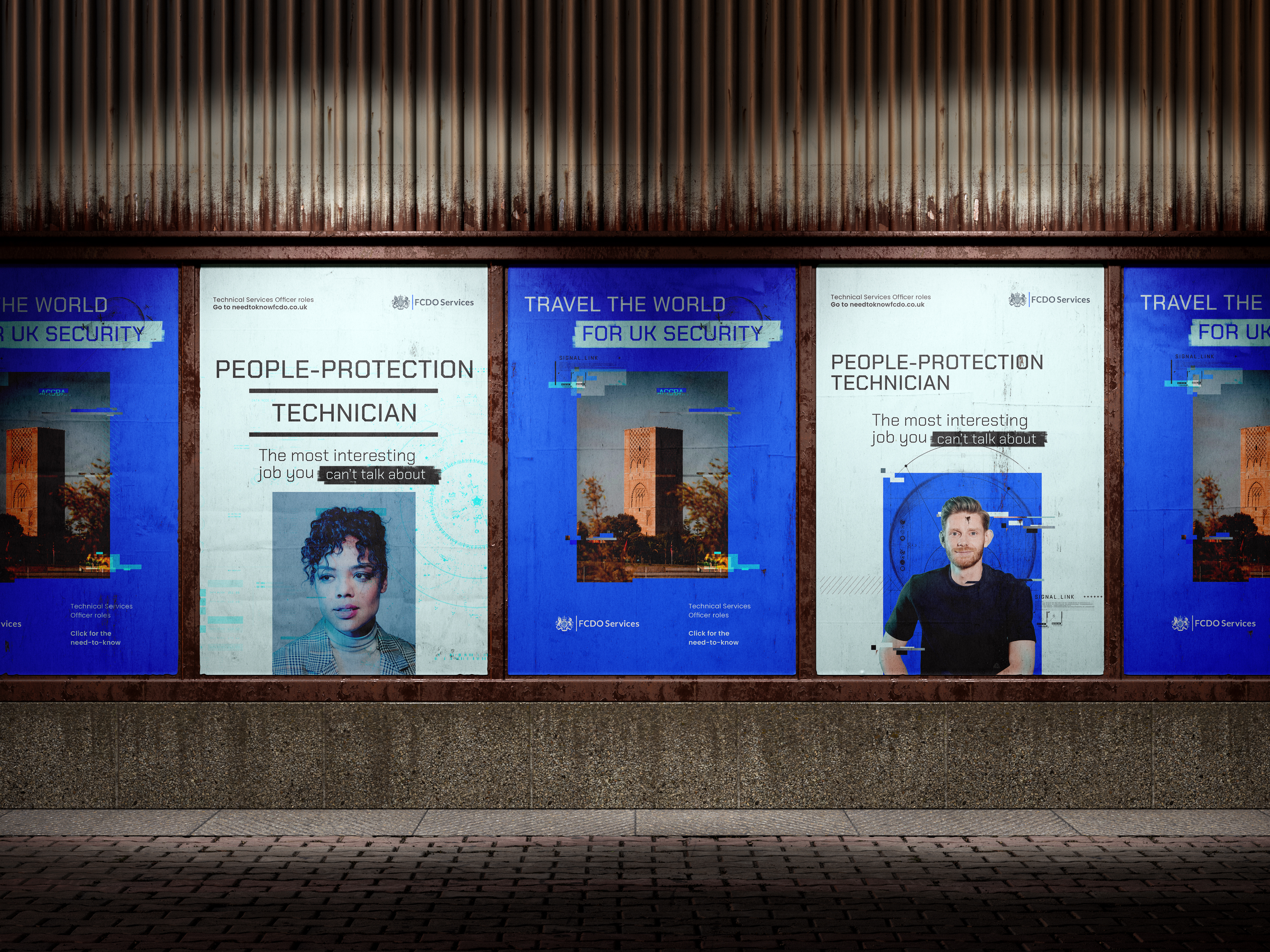
A new business pitch [ which was won ] for FCDO to drive applicants to apply for the role of Technical Services Officer. Bond-esque visuals such as redaction, glitching and spyware were used to heighten the secretive nature of the role. Photography of exotic locations spoke to the international travel on offer.
↓
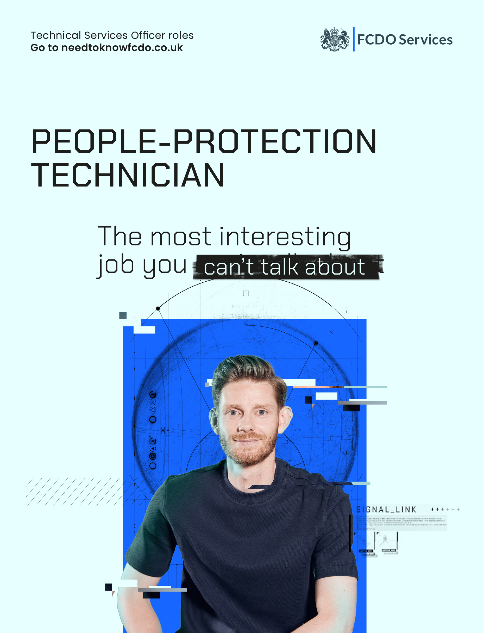
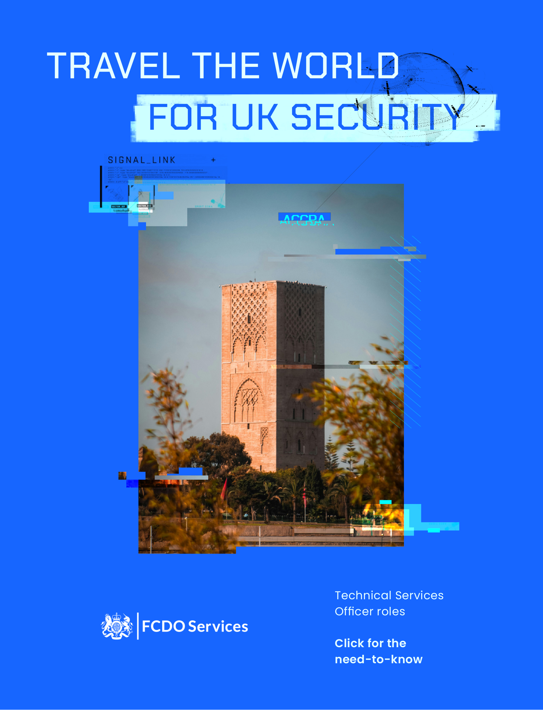
A series of posters were the starting point to explore two potential routes, the first one being people-centric, the second showing those exotic locations.
↓
A microsite was proposed, it’s main purpose to house the video which would make up the bulk of the campaign.
↓

A rough edit was shown at pitch stage.
↓
MPUs, podcasts, e-shots and social carousels were also built into the offering.
↓


Agency: TMPW
Heads of creative: Matt Broughton + Dan Turner
Project Managers: Cat Parkin, Shauna O’Brien
Senior copywriter: Rachel Sykes
Art Direction + design: Craig Baxter
Film: Eleni Skordis
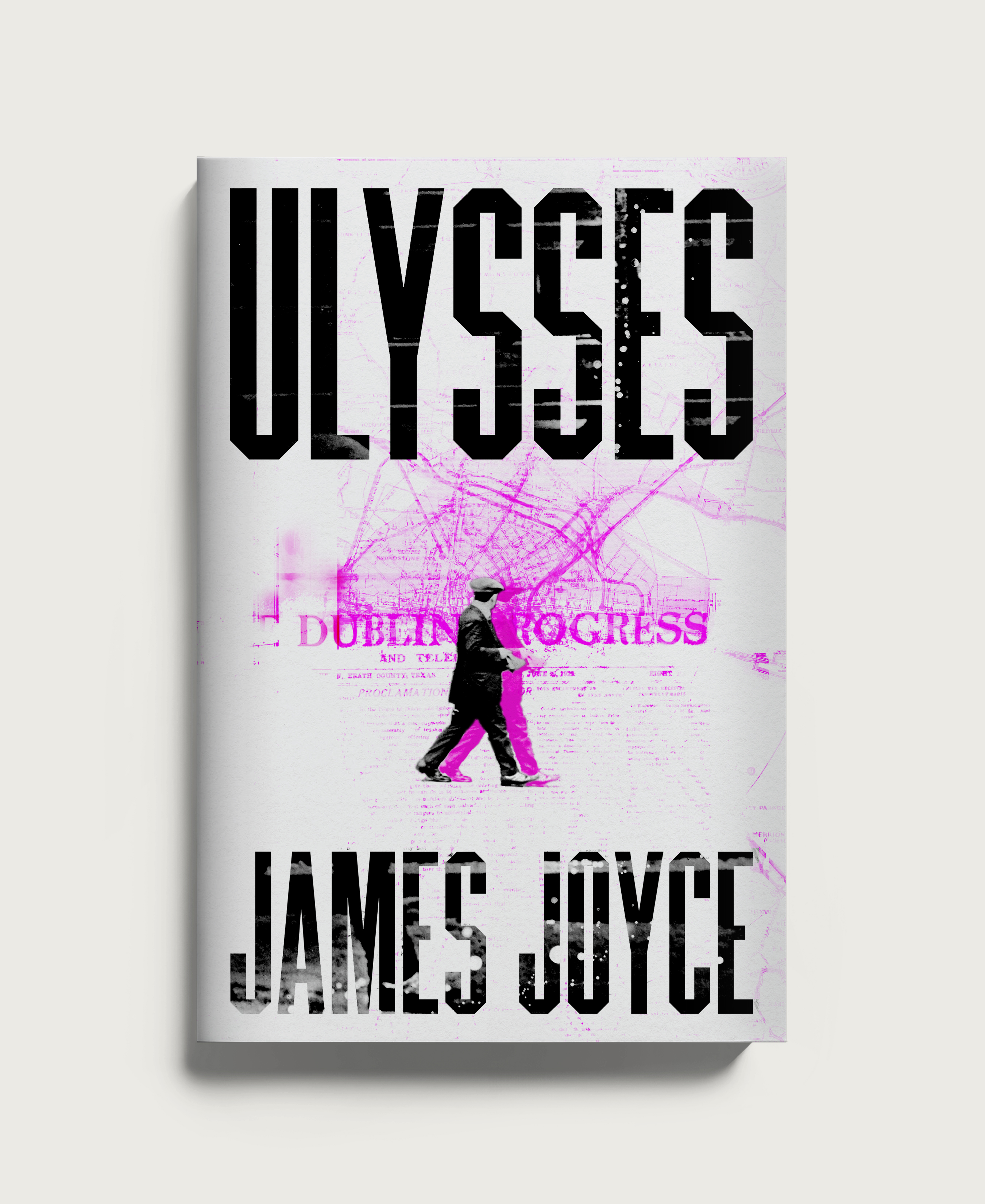
Book covers designed and illustrated for Bad Otter Press, a public domain publishing house.
↓


_______________________________________________