Role: Art direction + design.
Matriks Digital offer habitual, lifestyle and social community resources to support your personal development and fulfillment. They are motivational at heart, with a very strong visual USP.
↓

The rebrand was driven by building on what they already have, adding layers to emphasise the many ways their offering can help you take the first steps in the right direction.
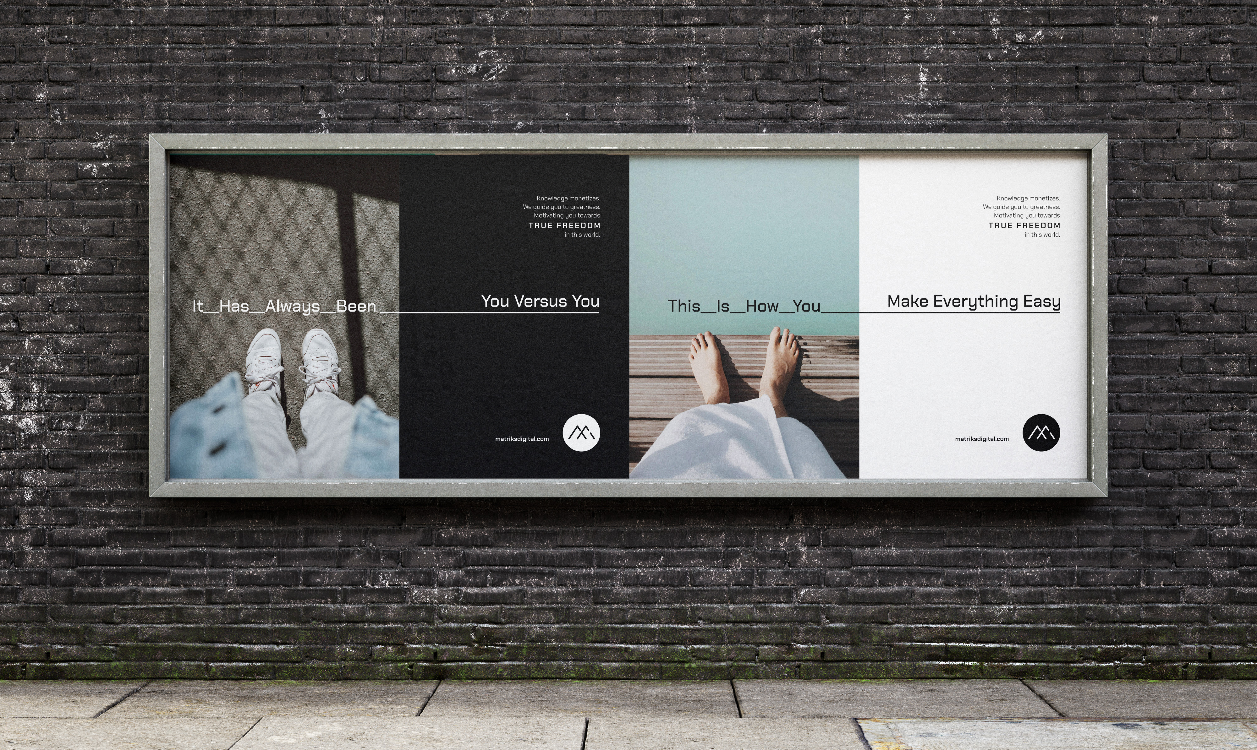
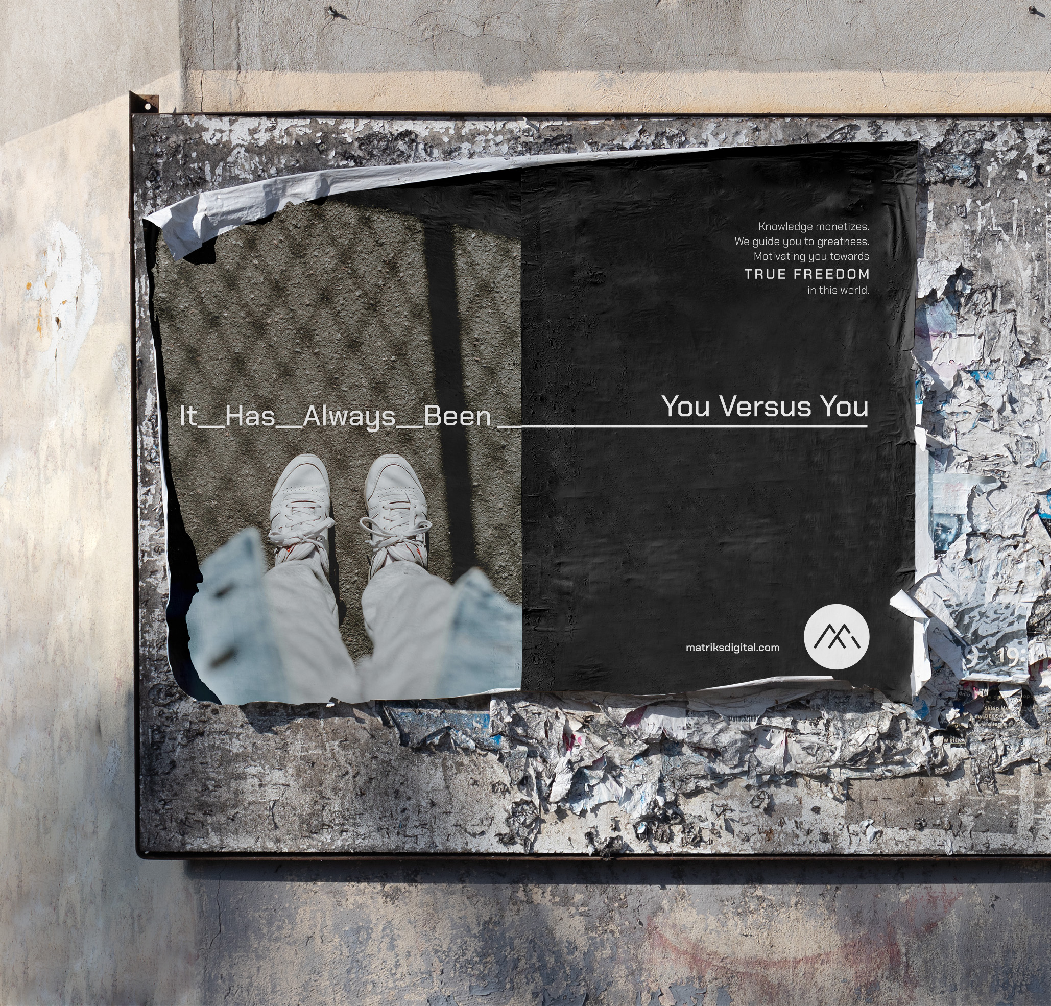
Taking the lead from messages on their popular social channels, stand-alone posters were developed using the photo and video style that has made them so distinctive. The typographic approach strengthened the idea of turning a corner towards positive change.
↓


Social carousels were created to align with the multi-sheet design approach, which uses underscoring to connect each word in the first half of the statement, while the second half has the words underlined in their entirety.
↓

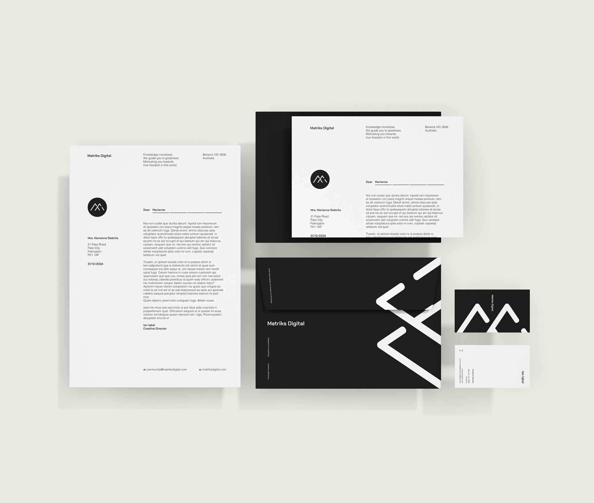
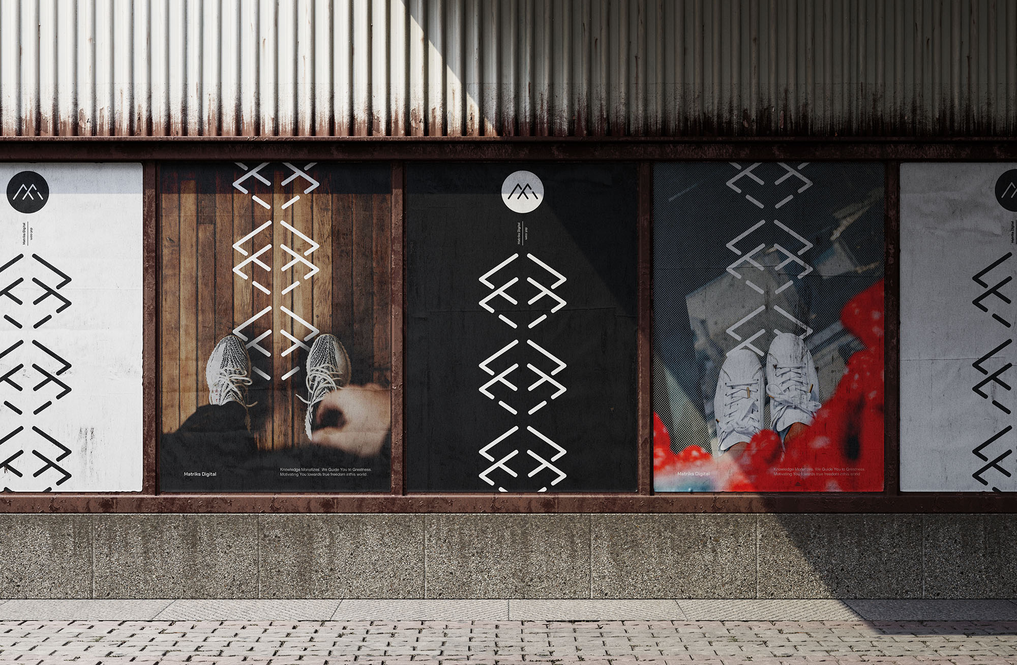
The new work was then rolled out across various brand-appropriate physical formats.
↓


A column influenced by the DNA strand was created using the logomark, building on the idea that the Matriks proposition had to become part of you in order to truly be effective. It also served as a ‘path forward’ for the feet in the photography.
_______________________________________________